
In the rapidly evolving world of communications and AI, conveying complex information clearly and effectively is more important than ever. As someone exploring the intersection of artificial intelligence and public relations, I’ve analyzed two infographics that effectively break down intricate AI concepts into visually digestible formats. These examples not only inform but also inspire better design practices for anyone creating infographics on technical topics.
1. Artificial Intelligence in Business
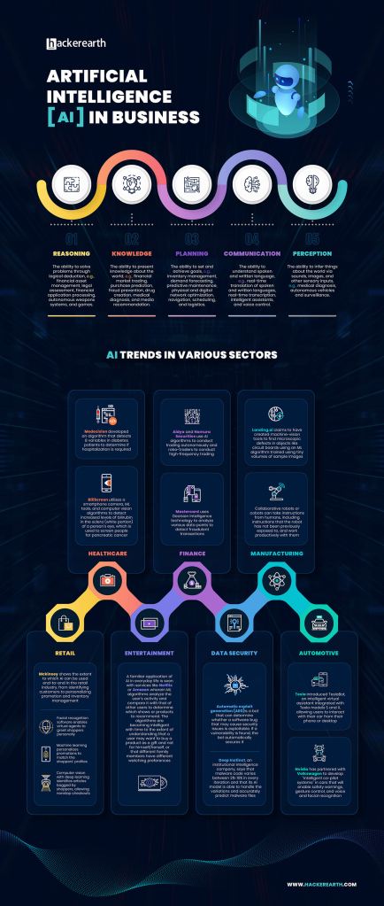
This infographic from Visual Capitalist highlights how AI is transforming different business sectors—from marketing and HR to finance and logistics.
Why It’s Effective:
- Visual Hierarchy & Organization: The layout uses a winding path with clear section dividers, making the progression of information easy to follow. Icons at the top simplify each use case before diving into more detail below.
- Color Choices: Each section is color-coded, making it easier to distinguish between categories and trends. The dark background helps the bright icons and text pop.
- Typography: Headings are large and legible, and subtext is minimal but informative. The font style is consistent, clean, and easy on the eyes.
- Text-Visual Balance: Visual cues like icons and charts guide the reader through the content, keeping it from feeling text-heavy.
- Data Storytelling: It begins with broad insights (AI use cases), moves into industry-specific applications, and ends with forward-looking trends. This flow tells a compelling, logical story of AI’s growing role in business.
- What I’d Apply: The use of a winding path and color segmentation is a great way to organize sections of an infographic about evolving technology use in PR—something I’d like to try for my own project.
2. Agentic AI vs. AI Assistants by USAII

This infographic compares two types of AI: the reactive AI assistants we know (like Siri and Alexa) and more autonomous, proactive agentic AI systems.
Why It’s Effective:
- Visual Hierarchy & Organization: The layout is vertically aligned and uses large, bold headers to clearly separate each section—ideal for mobile scrolling.
- Color Use: It uses contrasting tones—purple for AI assistants and blue for AI agents—to visually reinforce the comparison. Highlights in pink and neon blue draw attention to stats and keywords.
- Typography: The font hierarchy makes distinctions between titles, data points, and descriptions very clear. Keywords are emphasized using color and bold type.
- Text-Visual Balance: The infographic integrates small illustrations (like robots, gears, and tech icons) alongside short, punchy text. These visuals help translate abstract concepts into relatable images.
- Storytelling: It starts with the market value of AI assistants, builds into definitions and examples, and ends with a feature-by-feature comparison chart. The story has a clear beginning, middle, and end.
- What I’d Apply: The side-by-side comparison chart is a helpful way to clarify differences in complex technologies. I’d like to include a similar chart in my infographic to contrast AI tools used in PR education and practice.
Final Takeaways
These infographics are strategic visual tools. They work because they:
- Prioritize clarity through structure and design
- Use color and typography to guide the eye
- Balance visuals and text to avoid overwhelming the viewer
- Build a logical narrative that draws you in
As I build my own infographic on AI literacy in public relations, I plan to implement some of these tactics Using strong organization, strategic color choices, and clear storytelling will help me translate complex data into something my audience can understand and act on.

Leave a comment